A virtual hair color try on free preview is best treated like a dressing-room mirror: useful, immediate, and slightly unkind when the lighting is bad. It can show whether your face wakes up beside copper, softens beside beige blonde, or disappears under a shade that looked beautiful on someone else. What it cannot do is lift old dye, measure hair condition, or promise that a salon formula will land exactly where the screen suggests. The value is in narrowing the decision before money, bleach, and months of grow-out get involved.
What a free try-on can honestly tell you
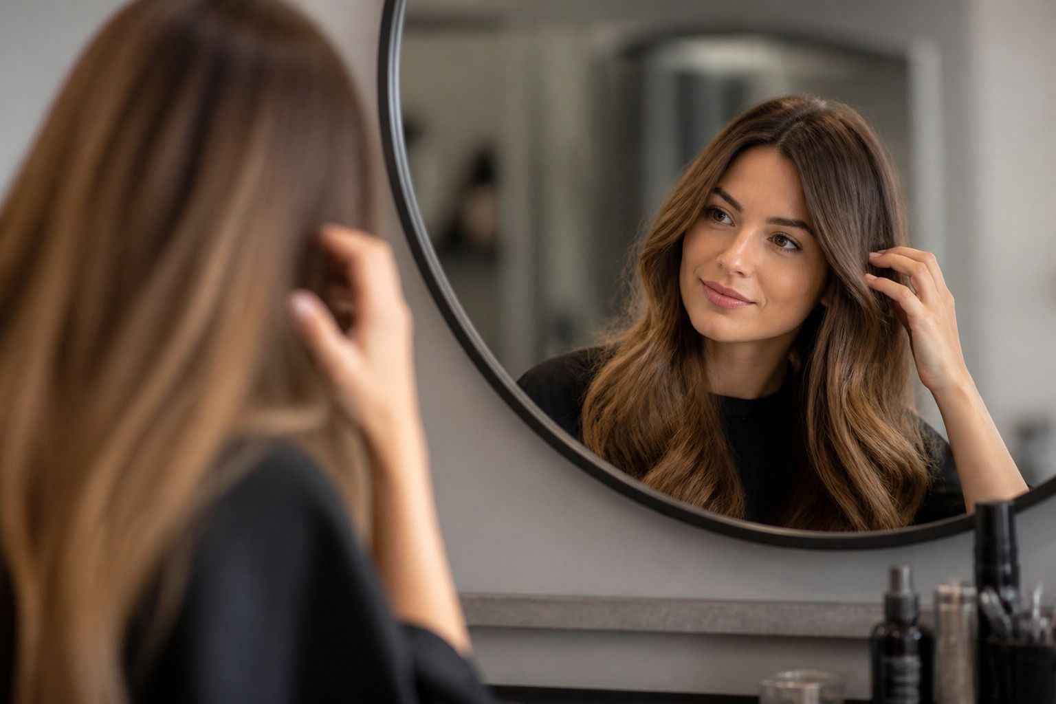
The most useful thing a hair color try on does is remove the borrowed fantasy from inspiration photos. A model with studio lighting, freshly waved hair, and professional makeup is not a fair comparison. Your own photo is more direct. If a cool brunette sharpens your eyes but makes the skin look flat, you will see it quickly. If a honey blonde brings warmth to the face but also pulls attention to redness, that is visible too. The preview is not a verdict; it is a first reaction in familiar proportions.
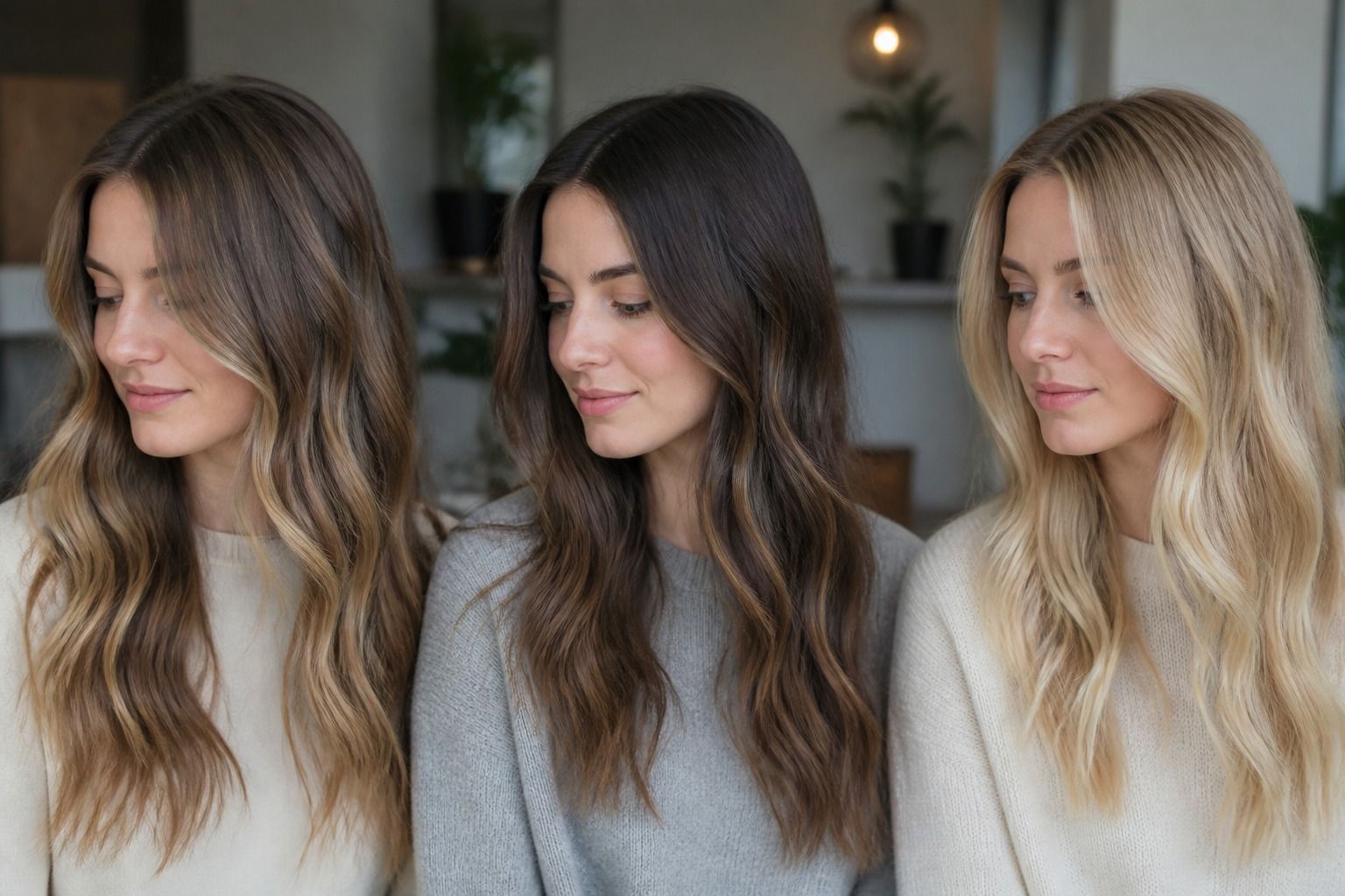
I like using it for broad choices first: lighter or deeper, warmer or cooler, softer or more dramatic. Those decisions matter more than a pretty shade name. A medium neutral brown and a deep espresso may both be called brunette, but they do completely different work around the face. The same is true for blonde. Beige, pearl, champagne, and gold can sit only a few tonal steps apart in a menu, yet one may look expensive and another may look oddly separate from the skin.
Where free virtual color is weaker is texture and history. It may paint a smooth color over highlighted ends, curls, roots, or grown-out balayage as if the hair were one even sheet. Real hair is rarely that polite. Still, the preview can show whether you enjoy the direction. If you save two or three versions and can explain why one feels better, you already have a better salon conversation than a folder of unrelated celebrity screenshots.
Take the photo before judging the shade
A poor photo can make a good color look wrong. Use indirect daylight, not bathroom downlights and not golden sunset through a window. Stand facing the light, keep the camera at eye level, and leave the hair as visible as possible around the face. A plain top helps because bright fabric can bounce color into the skin. Red knitwear, lime workout tops, and orange walls are surprisingly persuasive liars when a digital overlay is trying to decide what belongs to the hair.
Skip heavy filters and smoothing. A beauty filter may blur the hairline, brighten the eyes, and cool the skin before the color is even applied. Then the try-on is testing a face you do not wear in normal daylight. If your hair is curly, very dark, or strongly highlighted, take a second photo with the front sections controlled so the shape is easier to read. If the overlay bleeds onto the cheek or misses the hairline, do not overinterpret the result. The tool has lost the edge of the canvas.
It also helps to take one photo with your usual makeup and one with a bare or nearly bare face. Hair color interacts with contrast. A cool blonde that looks chic with a black liner and defined brow can feel washed out on a quiet weekday face. A warm brunette may look soft and believable without makeup, then too heavy with a bronzed evening look. Both observations are useful. You are not choosing a shade for one perfect selfie; you are choosing something you will meet in mirrors, lifts, shop windows, and rainy car reflections.
Compare undertone before falling for a color name
Most bad try-on decisions come from comparing too many variables at once. A pale ash blonde against a deep copper brunette tells you almost nothing because the level, temperature, and contrast all changed together. Start with three shades at a similar depth: warm, cool, and neutral. For brown hair, that might be golden chestnut, ash brown, and neutral cocoa. For blonde, try honey, beige, and pearl. For red tones, compare copper, auburn, and a softer rose-brown rather than jumping straight to the brightest version.
| Try-on choice | What to watch on your face | Salon reality check |
|---|---|---|
| Warm brunette or copper | Can add glow, but may underline redness or make pink skin look hotter. | Often needs gloss maintenance; faded warmth can turn orange if the base is uneven. |
| Cool blonde or ash brown | Can make eyes look clearer, but may drain warmth from softer complexions. | Usually needs toning and may require lifting past strong yellow or orange pigment. |
| Neutral beige or cocoa | Can feel balanced and wearable when warm and cool extremes both look forced. | Still needs a clear target level; neutral is not the same as no formula. |
Once the temperature is clear, change the depth. Move one or two levels lighter, then one or two levels deeper, keeping the undertone close. This is the moment when many people discover they do not want a new color family at all. They want more softness around the face, less heaviness at the ends, or a root shadow that makes the grow-out calmer. A virtual hair color try-on free session is good for that kind of honest editing, provided you do not treat every dramatic option as equally practical.
Read the preview through your starting hair level
The screen does not know how stubborn your current color is. If you have natural dark brown hair and the preview shows icy blonde, the image is skipping the difficult middle: lift, warmth, toner, bond care, and sometimes more than one appointment. If you have old box dye through the lengths, the bright beige bob on the screen may be less a first visit and more a long negotiation. That does not mean the shade is impossible. It means the preview is showing the destination without the cost of the road.
Starting level matters because hair reveals underlying pigment as it lightens. Dark brunette often exposes red-orange, medium brown exposes orange-gold, and dark blonde exposes yellow. Cool previews look especially clean because digital color can mute that warmth instantly. A colorist cannot simply press the same button. They have to decide whether the hair can lift safely, how much warmth will remain, and whether the final tone will be stable or only beautiful for the first week.
Condition matters just as much. Porous ends can grab toner and look smoky or dull while healthy roots stay brighter. Curly hair can appear darker because of shadow and density. Fine hair may show banding more quickly if old color overlaps. When a preview looks perfect, ask a less glamorous question: what would this look like after three washes, with roots, under office lighting, and when the ends are dry? That question does not ruin the fantasy. It protects the version of the fantasy you can actually maintain.
Use the preview to plan placement, not only color
A flat all-over overlay can accidentally hide the most important part of a good dye job: placement. You may not need every strand to become lighter. You may need softness around the hairline, a few brighter ribbons through the front, or a deeper root so the whole color looks intentional instead of grown out. When you find a preview you like, look at where your eye goes first. Is it the shade itself, or the brightness near the face? Is the color flattering because it is warm, or because it creates contrast against your eyes and brows?
This is where screenshots become useful. Save the version you love and mark it with plain language: brighter around the face, not too gold, deeper root, soft ends, no harsh stripe. Those notes are more practical than saying you want a certain named trend. Trend names travel badly. One person's caramel brunette is another person's orange balayage; one salon's mushroom brown is another salon's flat ash. Placement words are harder to misunderstand.
If you are testing red tones, placement is even more important. A full copper can look thrilling on screen and demanding in real life, especially if your wardrobe leans cool or your brows are very ashy. A muted auburn gloss, a warm brunette base, or a few copper pieces may give the same energy with less upkeep. The try-on should help you choose the level of commitment. It should not bully you into the loudest version because it photographs well for thirty seconds.
Turn the best image into a safer salon plan
Before booking, put your favorite preview beside a clear daylight photo of your current hair. Then write a short description in ordinary words: current level, old dye or bleach, how much maintenance you can tolerate, and what you liked in the preview. For example: medium neutral brunette, soft brightness at the front, no orange, root shadow preferred, willing to tone every eight weeks. That is the kind of detail a colorist can work with. It separates taste from technical route.
Ask what is achievable in one appointment and what would be healthier in stages. A strand test is sensible if the hair has old permanent color, repeated lightening, or fragile ends. So is a gloss-first approach when you are unsure about temperature. If the preview suggests a cool blonde but your hair is a warm level six, a softer beige brunette with face-framing lightness may be the more elegant first move. A good plan does not copy the screen blindly; it translates the part of the screen that made you look like yourself, only better lit.
At home, keep the same discipline. If you are buying color from a shelf, do not choose only from the front of the box. Compare your starting level, read the tone family, and be honest about previous dye. Box color cannot lift old color into a clean blonde, and a virtual overlay cannot change that. The free try-on has done its job when it saves you from impulsive extremes, gives you language for undertone and placement, and helps you walk into the next step with fewer romantic assumptions and better questions.