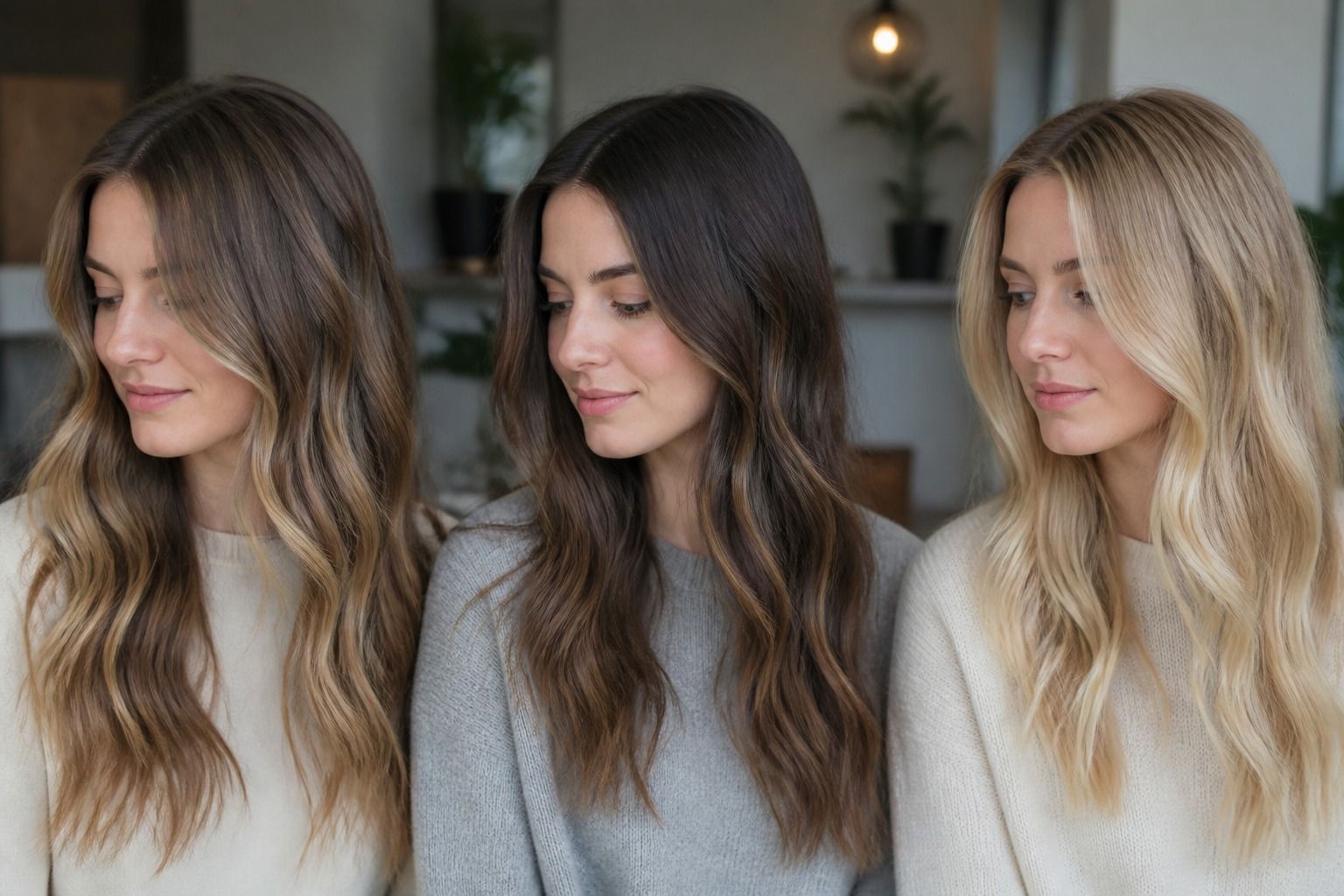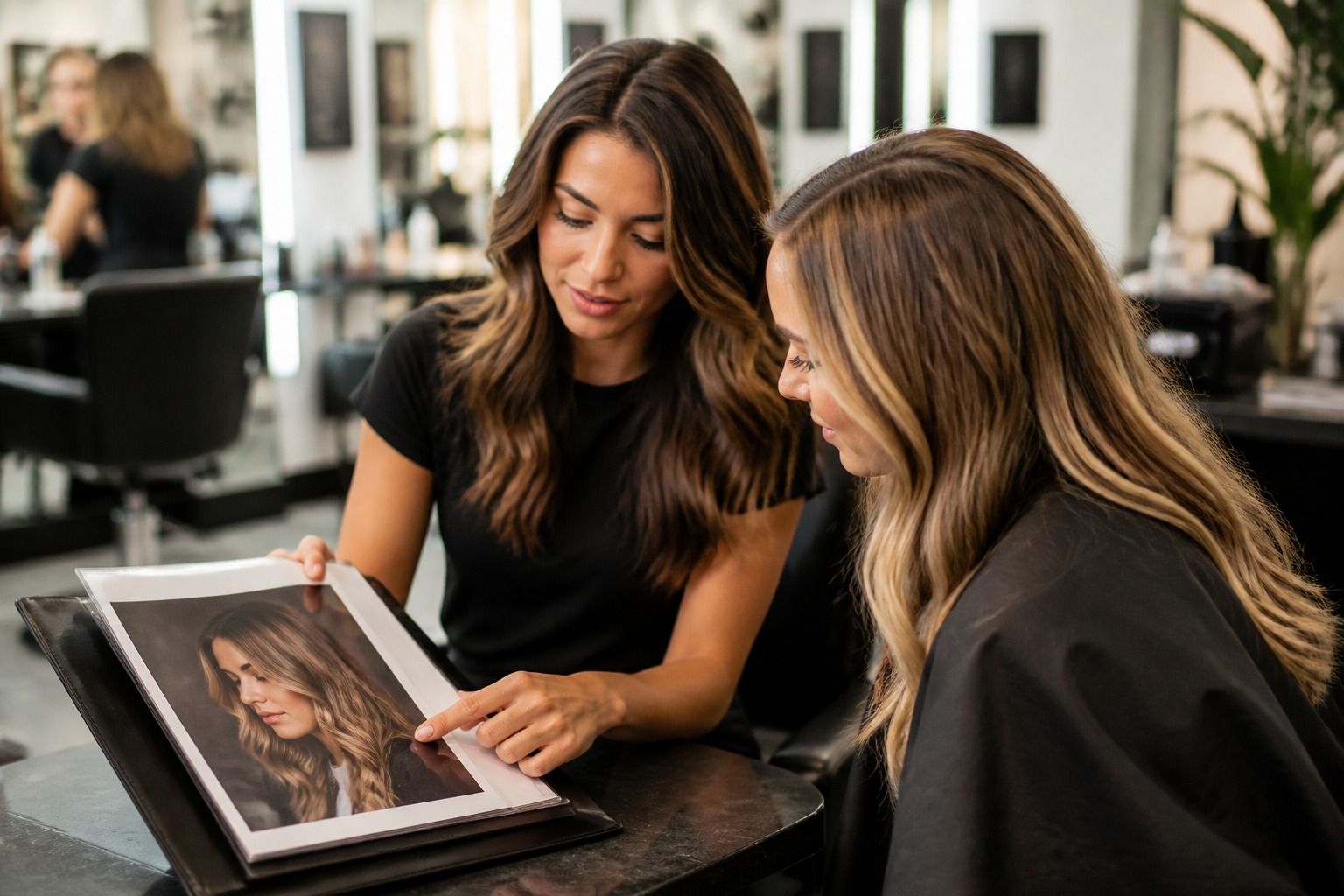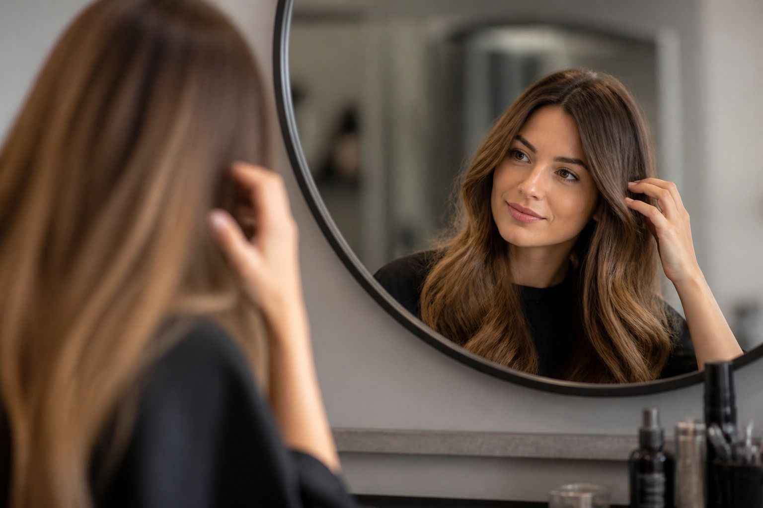
A virtual hair color try on is most helpful when it slows down a decision, not when it flatters every shade into looking wearable. The point is not to prove that copper, espresso brunette, champagne blonde, or blue-black can look exciting for five seconds on a phone screen. The useful question is quieter: will the color still feel balanced beside your skin, eyes, brows, haircut, clothes, and real lighting after the salon cape comes off?
What makes a try-on genuinely useful
The best virtual hair color try on is not necessarily the one with the biggest shade wall. A long menu of fantasy reds and glossy blondes can be fun, but a serious comparison starts with accuracy around the face. Look at the hairline, temples, parting, ears, and the small flyaway pieces near the cheek. If the tool paints over skin, misses dark roots, or leaves a pale halo around the head, the preview may still entertain you, but it is weak evidence for a color appointment.
A useful hair simulator lets you test restraint. That sounds less glamorous than a dramatic makeover, but most real salon decisions live in the narrow zone between two believable shades. A warm chestnut and a neutral medium brown may both look brunette in a thumbnail, yet one can brighten olive skin while the other turns it slightly gray. A soft beige blonde may feel elegant until it sits next to warm hazel eyes and suddenly looks dusty. The preview should help you see those small shifts, not only the before-and-after shock.
Seasonal color analysis can help here, as long as it is treated as guidance rather than a verdict. A person who often suits Soft Autumn colors may look more settled in muted caramel, mushroom brown, or soft copper than in icy platinum. Someone who reads closer to Winter may carry espresso, blue-black, or cool burgundy with more clarity. Still, a photo cannot confirm a season with certainty. Makeup, camera exposure, self-tanner, old dye, and indoor bulbs can all distort the result. The try-on is a rehearsal, not a diagnosis.
The difference between a color overlay and a real hair mask
Many tools can place color on top of a photo. Fewer can understand where the hair actually is. A basic overlay behaves like tinted glass: it covers a broad area, often including forehead shine, earrings, neck shadows, and the collar of a white shirt. It may make a vivid cherry red look smooth on straight hair because the whole shape has been flooded with one tone. On curly hair, layered cuts, or wispy bangs, the weakness shows quickly. The curl pattern disappears, and the new color looks like a sticker.
A better hair mask follows texture. It keeps the deeper pockets under waves, respects the bright pieces where light catches the crown, and does not turn every strand into the same flat block. This matters because hair color is never just a paint chip. A dark ash brown on glossy straight hair can read polished and expensive; the same ash on dry curls may need warmer lowlights to avoid looking heavy. A copper gloss on a layered bob can look lively if the highlights remain dimensional, but artificial if the simulator erases every shadow.
Check the mask by choosing a shade close to your current color first. If a subtle change already looks strange, a bold change will only hide the problem. Try a level or two lighter, then a level or two darker. Watch the roots and the perimeter around the shoulders. If the app handles a soft brunette shift well, it is more likely to give you a useful preview of auburn, bronde, or cool brown. If it fails on near-neutrals, do not trust its most dramatic transformations.
Shade controls that help with real decisions
Good shade controls are less about novelty and more about separating depth, temperature, and intensity. Depth asks how light or dark the hair is: black, dark brown, medium brown, dark blonde, light blonde. Temperature asks whether the shade leans warm, neutral, cool, golden, copper, violet, or ash. Intensity asks whether the result is soft and muted or clean and bright. When these controls are bundled into one slider, the preview can feel magical but vague. You need to know which part made the color work.
For salon decisions, side-by-side previews are more useful than a carousel. Place your current color next to two possible changes: one safe, one slightly braver. For example, compare neutral chocolate brown, warm chestnut, and soft copper under the same photo. Or compare dark blonde, beige blonde, and champagne blonde without changing your makeup. The winner is often not the most dramatic shade. It is the one that makes the skin look steadier, the eyes clearer, and the wardrobe you already own feel less demanding.
Root and highlight controls are especially important if your hair is not a single flat color. Dark roots can make a lighter shade wearable because they keep contrast near the brow. Face-framing pieces can brighten the complexion without committing the whole head to blonde. A virtual preview that only offers all-over color may push you toward a decision that would be too expensive or too harsh in real life. If you usually wear dimensional color, test tools that can suggest balayage, gloss, lowlights, or a rooted version of the shade.
Lighting and photo quality can change the answer
The photo you upload is part of the result. A bathroom mirror under warm bulbs will make skin and hair look more golden. A cloudy window can cool everything down. Direct sun may blow out highlights and make blonde look cleaner than it will look indoors. If you are using the preview before a serious color change, take at least two photos: one facing a window in natural daylight and one in the lighting where you actually spend time, such as an office, kitchen, or evening event space.
A clean photo does not need studio polish. It needs honest color. Pull hair away from heavy shadows, remove sunglasses, and avoid strong filters. Keep makeup ordinary for you, not unusually warm or cool. Wear a top in a color you reach for often: navy, cream, black, camel, soft white, denim, or olive can reveal how the hair sits with your wardrobe. A shade that looks appealing beside a bare face may feel wrong once it meets your favorite black blazer or oatmeal sweater.
Camera angle matters too. A selfie from above can shrink the jaw and overexpose the forehead, which makes many hair colors seem softer than they are. A straight-on photo with the full hair shape visible gives the mask more information. If you have curls, coils, or a fringe, take the picture on a normal hair day rather than after unusual styling. The question is not whether the app can beautify one perfect image. It is whether the shade survives your real texture.
Privacy checks before uploading your face
Hair color previews use personal images, and a face photo is not a trivial file. Before uploading, look for plain information about what happens to the image: whether it is stored, used to improve models, shared with third parties, or deleted after processing. If the tool gives no clear answer, treat that as part of the comparison. A quick preview is not worth handing over a high-resolution face image without knowing where it goes.
There are practical ways to lower the risk. Use a cropped photo that shows hair and face but not your home, children, documents, license plate, or work badge in the background. Avoid uploading a professional headshot if you do not need to. If the tool works on-device, that can be reassuring, though the claim should be checked in the product details rather than assumed from a friendly design. If the app requires account creation for a simple preview, ask whether saving an image is important enough to justify it.
Export quality is another privacy-adjacent issue. A low-resolution preview may be fine for your own first pass, but too blurry for a colorist to interpret. A salon consultation benefits from a clear side-by-side image, ideally with the original photo included. If the export adds watermarks, crops the forehead, or changes skin smoothing at the same time as hair color, it becomes harder to discuss the shade honestly. The cleanest export is boring in the best way: original face, visible roots, no filters, no extra branding.
A simple comparison checklist for two or three tools
Do not test ten tools in one sitting. After the fourth or fifth preview, almost every shade starts to look plausible, and the decision gets noisier. Pick two or three options, use the same photo in each, and compare the same set of shades: one close to your current color, one seasonal-color-friendly option, and one shade you are curious about but unsure of. The best tool is the one that makes differences easier to explain, not the one that produces the most flattering screenshot.
| Feature to compare | What to check | Why it matters |
|---|---|---|
| Hair mask | Look at the hairline, curls, bangs, roots, and shoulder edges. | A weak mask can make a bad shade look smooth or a good shade look fake. |
| Shade controls | Test depth, warmth, coolness, and intensity separately when possible. | You need to know whether the winning shade works because it is darker, softer, warmer, or clearer. |
| Side-by-side preview | Compare original, safe change, and brave change on the same screen. | Small differences are easier to judge when your eye is not relying on memory. |
| Lighting realism | Use both daylight and everyday indoor lighting photos. | Warm bulbs, cloudy windows, and direct sun can each favor different hair colors. |
| Privacy and export | Check image storage terms, cropping, resolution, and visible watermarks. | A salon-ready preview should be clear enough to discuss and safe enough to share. |
When you compare results, write one sentence under each saved preview: what improves, what gets worse, and what you would ask a colorist. For a copper preview, that might be whether the warmth brightens the face or competes with redness. For a cool brunette, it might be whether the depth sharpens the eyes or drains the mouth. For blonde, it might be whether a rooted beige version would be more believable than a bright all-over lift. Those notes turn a virtual hair color try-on from a toy into a useful consultation aid.
How to use the winning preview at the salon
Bring the preview as a starting point, not as a demand. A colorist still has to consider your current dye history, gray percentage, natural level, porosity, texture, and maintenance tolerance. A photo can suggest that soft copper suits your face, but it cannot promise the same result over old box dye. It can show that cool brunette looks elegant, but it cannot tell whether your ends will grab ash too strongly. The salon conversation should turn the digital direction into a realistic formula and timeline.
Ask practical questions. Can this be done in one appointment, or does it need a staged change? Will the shade require glossing every six weeks, purple shampoo, root smudging, or a different brow pencil? Does it still work if you air-dry your hair? How will it sit next to the clothes you wear most often? If seasonal color analysis influenced the choice, mention the palette gently: for example, you are trying to stay muted and warm, or clear and cool, rather than asking for a rigid seasonal label.
The best outcome is not a perfect match between screen and chair. Screens are backlit; hair reflects light; color formulas interact with the hair already on your head. A good preview narrows the field and gives you language. It helps you say that you want a brunette with warmth but not orange, a blonde that is beige rather than icy, or a red that reads soft copper rather than purple cherry. That is enough. The final shade still belongs to real hair, real light, and a colorist who can read both.