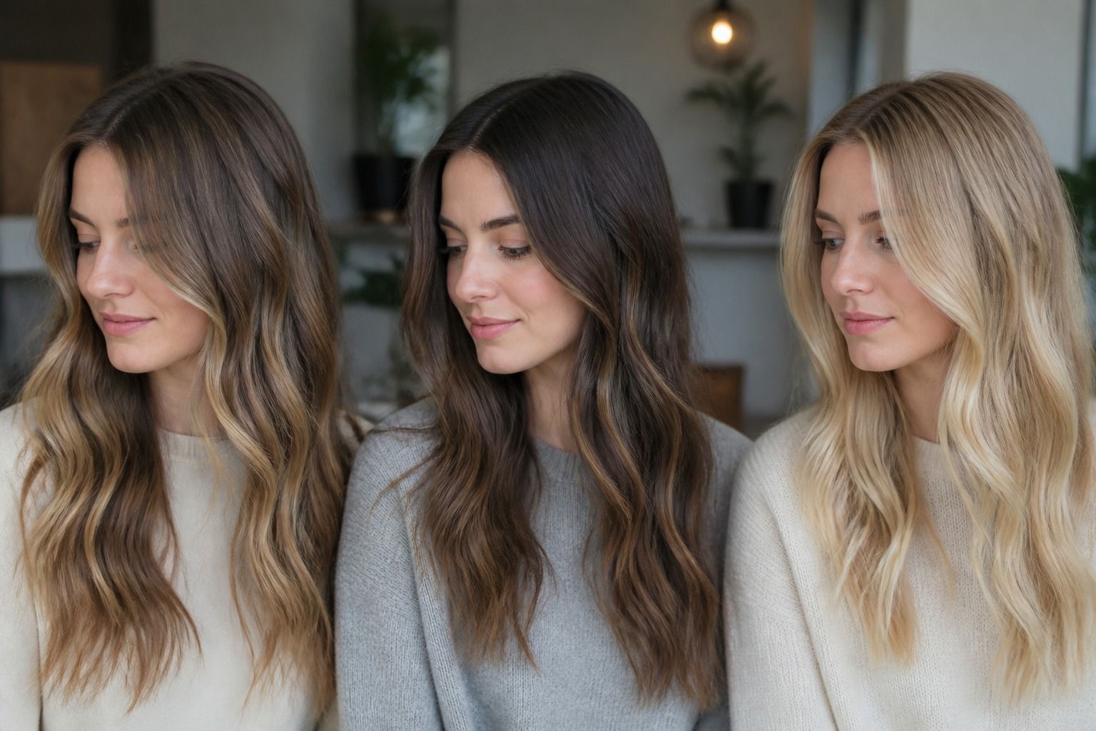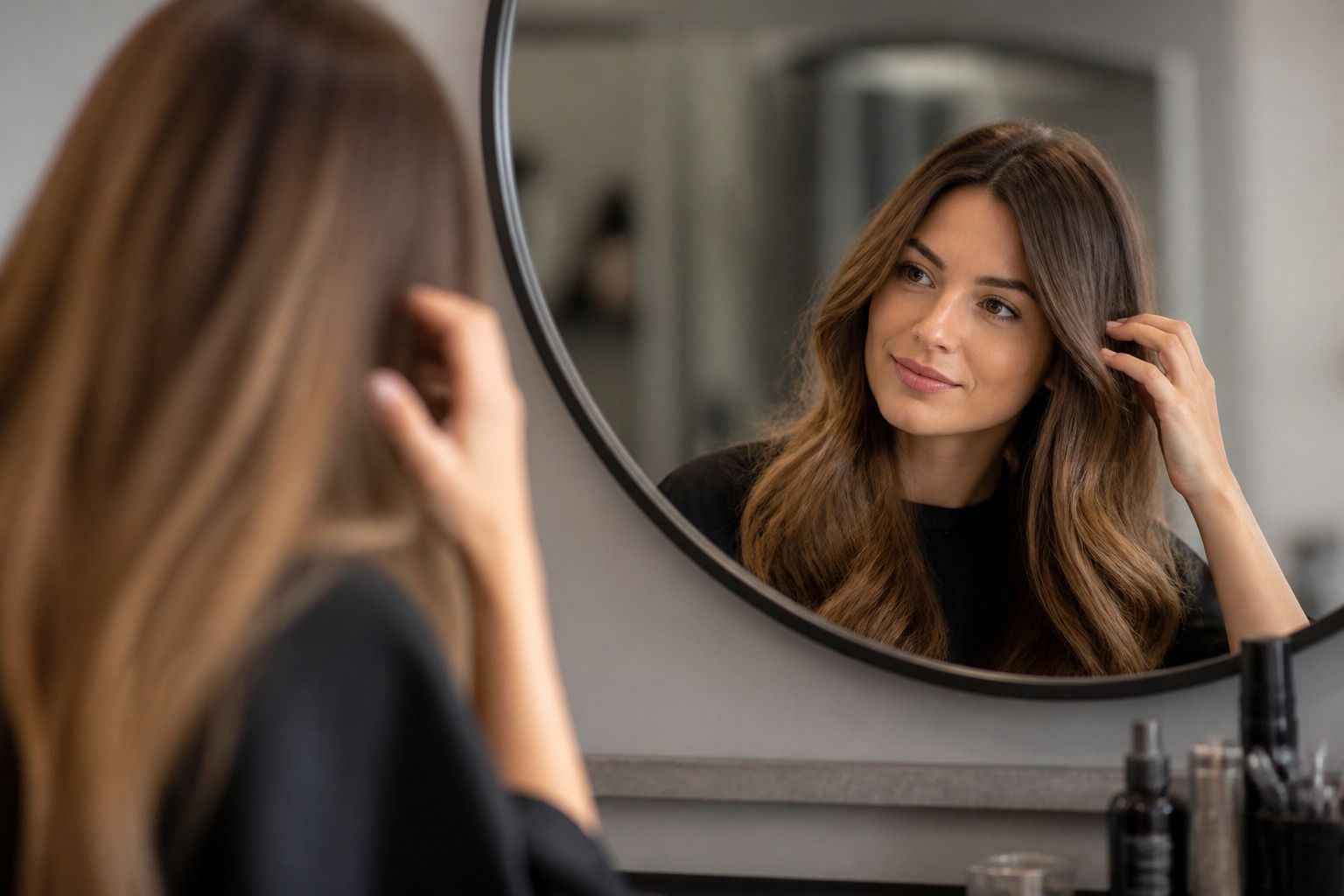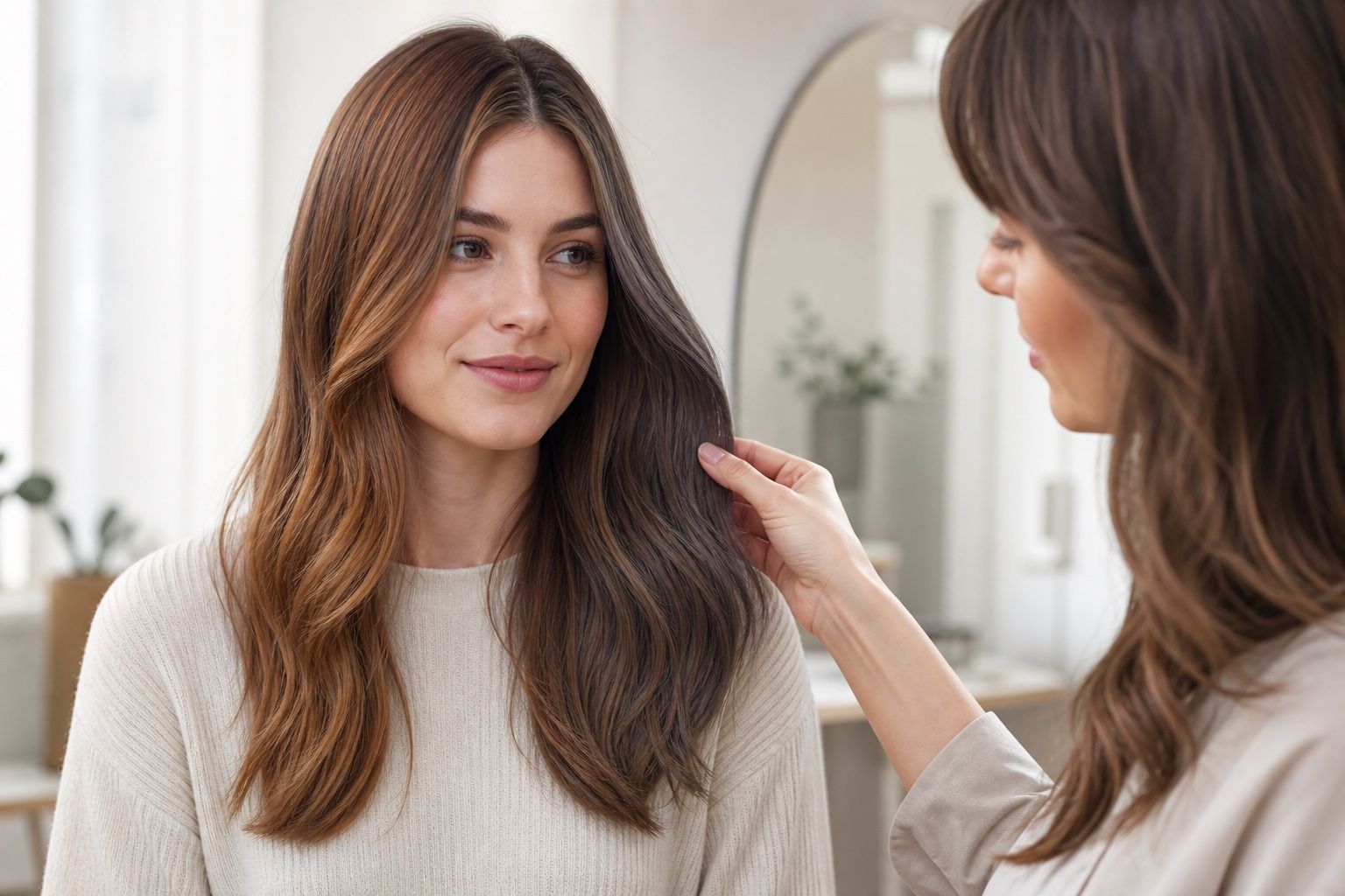
A hair color try on is most useful when it slows the decision down. A preview cannot promise the exact result a colorist will create on real hair, because porosity, previous dye, gray coverage, bleach history, and salon lighting all matter. Still, a careful virtual hair color try on can show something valuable before any developer touches your hair: whether warmth flatters the face, whether ash drains it, whether a darker frame feels elegant or heavy, and whether a shade belongs with the clothes and makeup you actually wear.
Start with a controlled photo instead of a dramatic filter
The first photo matters more than the app. A bathroom mirror under a yellow bulb will make almost every brown look warmer, while a car selfie can throw blue light across the skin and make a soft beige shade look dull. Use a clear front-facing photo near a window, with indirect daylight and no strong shadow across one side of the face. Pull your hair back if you are testing a major change, or leave the front pieces visible if you only want to judge face framing.
Keep makeup simple for the first round. Heavy bronzer can make copper seem easier to wear than it will be on an ordinary Tuesday morning, and a cool berry lip can rescue an ash brown that may otherwise feel severe. I like testing with the neckline of a normal top in the frame, because hair color is never seen alone. A charcoal sweater, a cream blouse, a camel coat, or a black T-shirt can reveal whether the new shade is working with your real wardrobe or only with the fantasy version of it.
Do not overread a single preview. Hair color software usually maps color onto the visible hair area and estimates shine and depth. It may not understand fine baby hairs, uneven layers, dark roots, or the difference between glossy salon finish and air-dried texture. The goal is not to choose the exact tube formula. The goal is to remove obvious mismatches and notice patterns before you sit in the salon chair.
Compare warmth before you compare the exact shade
Most people jump straight to shade names: golden brown, ash brown, copper, mushroom brown, soft black. Those labels are useful, but only after you compare temperature. Put one clearly warm option beside one clearly cool option at a similar depth. A golden brown and an ash brown at the same level will tell you more than five almost identical brunette swatches. If the warm shade makes the eyes look clearer and the skin smoother, that is useful information. If it makes redness look louder or the whites of the eyes seem less crisp, cool or neutral may be safer.
Seasonal color analysis can help here, as long as it is treated as a guide rather than a verdict. Warm springs and autumns often tolerate honey, copper, caramel, and golden brown better than smoky ash. Cool summers and winters often sit more comfortably near beige, taupe, cocoa, espresso, or blue-black families. But real people are not paint chips. Eye pattern, natural hair depth, contrast, tanning, gray percentage, and personal style can bend the rule.
When a virtual preview looks close but not quite right, try a neutral bridge. Neutral brown, soft espresso, dark blonde beige, and muted chestnut can sit between obvious gold and obvious ash. This is especially helpful when your skin reads neutral-cool in winter but warmer after sun, or when your wardrobe mixes navy, denim, cream, olive, and black. A try-on is good at revealing whether you need a strong temperature statement or a calmer shade that lets the face stay central.
How contrast changes the way a color frames the face
Contrast is the quiet reason one technically flattering color can still feel wrong. A pale face with light eyes may look fresh with soft medium brown but tired with flat black, even if both are cool. A deeper complexion with bright eyes may carry soft black beautifully while a muted beige brunette seems unfinished. In the preview, look at the edges of the face rather than the hair alone. Does the jawline look sharper in a good way, or does the hair become a dark helmet around the cheeks?
Depth also changes how clothing behaves. Darker hair can make black, white, navy, and saturated lipstick feel more intentional. Softer hair can make oatmeal, dusty rose, sage, denim, and brushed gold look easier. If your closet is mostly low-contrast and muted, a very dark try-on may suddenly make your usual clothes look sleepy. If your closet is graphic and high-contrast, a soft mushroom brown may be pretty in the app but less convincing with your favorite blazer or winter coat.
A useful trick is to make three screenshots at the same angle: your current color, one shade two levels lighter, and one shade two levels darker. Do not judge them immediately. Put them next to one another and check the face first. The best option usually makes the eyes visible before the hair color, keeps the skin tone coherent, and does not demand a completely new makeup routine. If the color is beautiful but your face disappears, it may be better as a highlight, gloss, or seasonal experiment than a full-head change.
Where highlights and balayage complicate the preview
Highlights are where virtual try-on tools become both helpful and misleading. A full overlay of copper may look too strong, but fine copper ribbons around the face could be lively and wearable. A solid ash brown may look flat, while a mushroom brown balayage with a little beige through the ends may feel softer. The preview can show the temperature direction, but it rarely shows real placement with salon accuracy.
Face framing deserves its own test. Bright pieces near the cheeks influence the skin more than color placed underneath or through the back. If you are considering blonde money pieces, copper ribbons, or cool beige highlights, create or imagine a preview where the lightest color sits around the face. Ask whether it makes the complexion look awake or whether it creates a hard stripe against the skin. On curly or wavy hair, remember that placement moves as the hair moves; a highlight that looks delicate on a flat image may read bolder in real texture.
| Try-on result | What it may suggest | Salon note to discuss |
|---|---|---|
| Warm all-over shade looks lively but intense | Warmth suits you, but full saturation may be too much | Ask about caramel, honey, or copper used in smaller sections |
| Cool brunette looks elegant but slightly gray | Coolness may work, but the shade needs depth or softness | Ask about cocoa, beige brown, or a gloss rather than a flat ash formula |
| Darker frame sharpens the face but feels heavy | Contrast helps, while a solid dark block may overpower | Ask about a shadow root, soft black with dimension, or lighter ends |
| Light pieces near the face look disconnected | The value jump may be too strong for your contrast level | Ask for a softer melt, thinner highlights, or less brightness at the hairline |
The table is not a formula, but it turns a vague reaction into language a colorist can use. Instead of saying I want this app color, you can say the warm version made my eyes brighter, but the all-over copper felt too loud. That is a much better starting point for a real consultation.
Check the shade against your wardrobe and daily lighting
A hair color that looks beautiful in a neutral photo still has to survive your life. Before you choose, test screenshots beside the colors you wear most often. If you live in navy, gray, white, and silver jewelry, a golden brown may need to be very soft to avoid feeling separate from the rest of you. If you wear camel, olive, ivory, rust, and gold jewelry, a smoky ash brunette may look refined in the preview but slightly chilly in the mirror.
Lighting is just as practical. Office LEDs can flatten warm brunettes and make ash tones appear greener. Sunset light can turn copper gorgeous or too orange. Phone cameras often increase contrast and saturation, which is why a shade may look more dramatic on screen than in person. If possible, view the same try-on screenshots at normal brightness, then step away from the phone and look again. The shade that still feels balanced after the initial excitement is usually the more durable choice.
Maintenance belongs in the decision too. Copper and red-brown families can fade quickly and often need color-safe care to stay polished. Cool brunette can turn warmer as it lifts or fades, especially on hair with old color underneath. Soft black may look simple but can be hard to remove later. A preview will not show that future awkward stage, so treat it as one part of the choice, not the whole choice.
What to bring from the try-on to a salon consultation
Bring three images, not twenty. One should be the shade direction you liked most, one should show what felt too warm or too cool, and one should show your current hair in honest lighting. A good consultation needs the comparison as much as the favorite. It helps the colorist understand your tolerance for warmth, your preferred contrast, and the kind of maintenance you might actually keep up with.
Use plain notes rather than app language. Say that golden brown made your face look warmer but emphasized redness, or that ash brown looked expensive but made your skin seem tired. Mention if you want the hair to work with silver jewelry, cream knits, black tailoring, or minimal makeup. These details sound small, but they help translate a digital impression into placement, gloss, toner, and depth decisions.
Finally, leave room for the professional reality of your hair. A virtual hair color try on does not know whether your ends are porous, whether box dye is hiding under the surface, or whether your natural base can lift cleanly in one appointment. The strongest use of a hair color try on is not certainty. It is a calmer, more specific conversation: warmer or cooler, softer or higher contrast, all-over color or face-framing dimension, dramatic change or gradual move. That is enough to make the next choice feel less like a gamble.