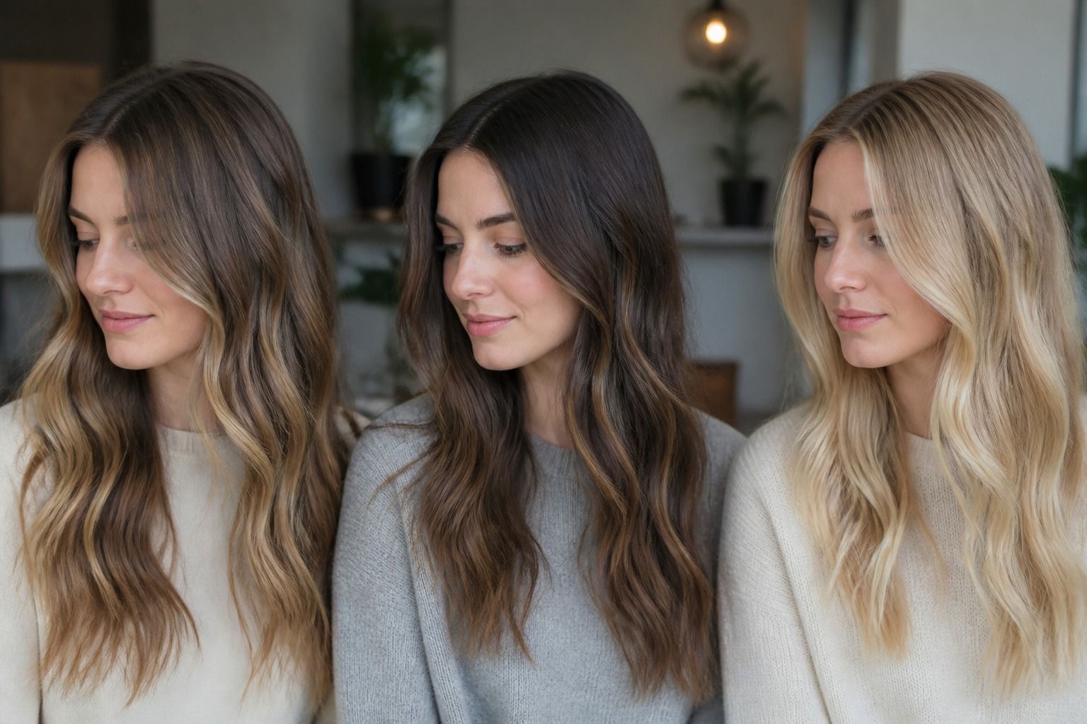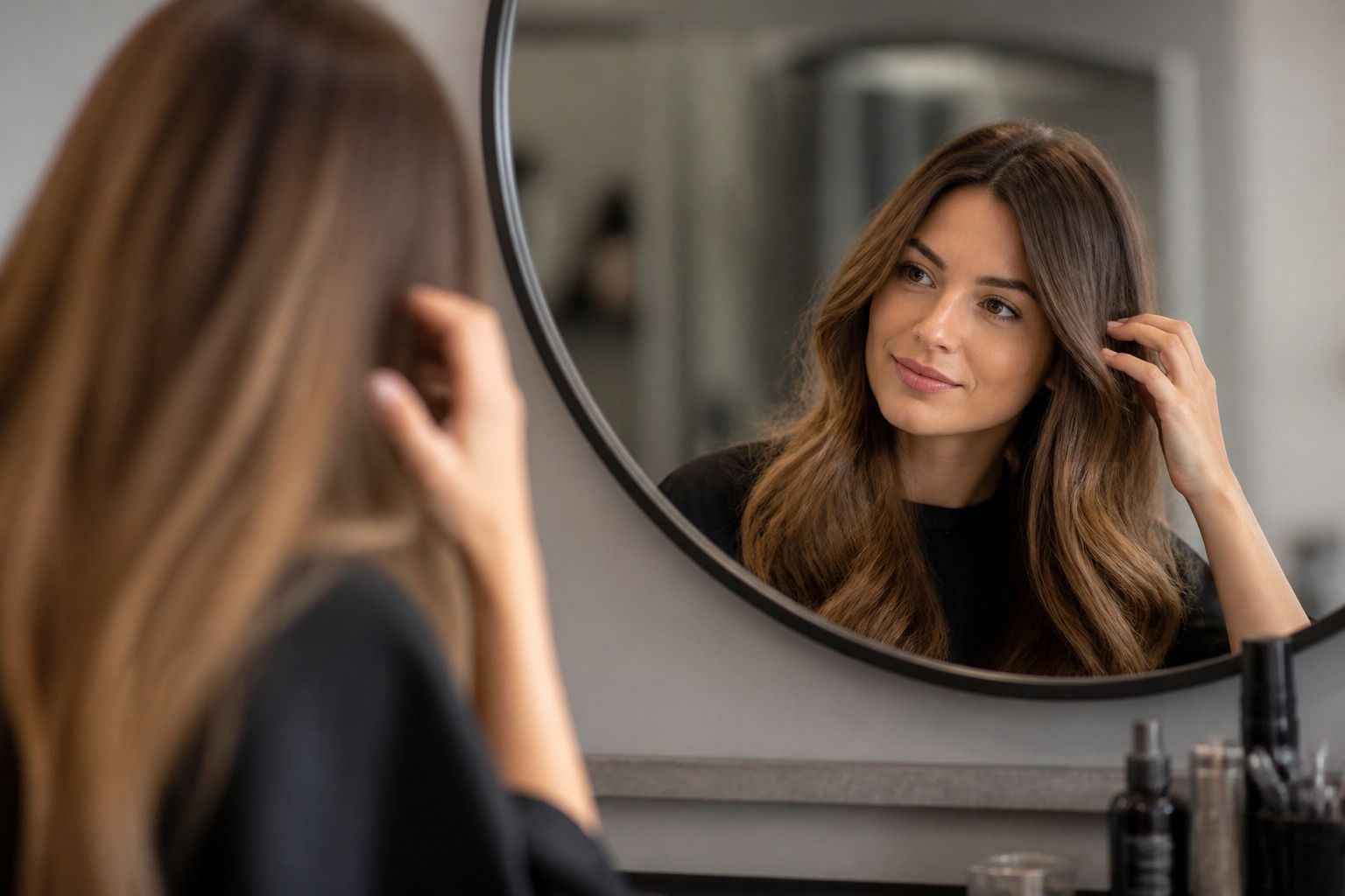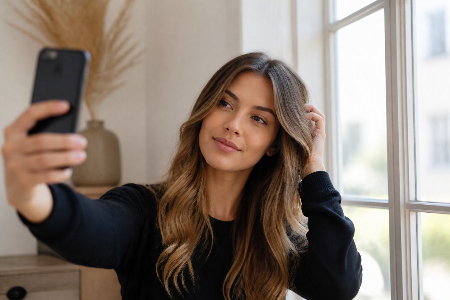
A free hair color analysis can be a useful first filter when you are circling around brunette, blonde, copper, or something softer and cannot tell which direction belongs on your face. It can notice broad clues in a selfie, especially contrast, depth, and whether a shade seems to fight your skin. It cannot promise your exact season, predict salon chemistry, or see what your hair will do after bleach. Treat it like a careful mirror, not a verdict. The better your photo is, the more helpful the answer becomes.
What a free photo-based check is useful for
The best use of a free hair color analysis is narrowing the field before you spend money or commit to a box dye. If you have twenty saved screenshots, it can help separate the colors that flatter your natural contrast from the ones that only looked good because the model had different brows, makeup, and lighting. That sounds modest, but it is often enough to stop a bad impulse decision at 10 p.m.
A photo-based check can usually describe simple visual relationships. Does very black hair make the face look sharper or heavy? Does beige blonde soften the skin or make it look flat? Does warm copper bring out brightness, or does it pull attention away from the eyes? These are appearance clues, not permanent labels. A single selfie may suggest that muted ash brown is calmer than golden caramel, but another photo in cleaner light might soften that call.
This is where seasonal color analysis can be helpful, as long as it is used with restraint. The seasonal method looks at undertone, depth, and contrast together. Someone with cool, clear coloring may often feel more balanced in espresso, cool brown, or icy beige than in orange copper. Someone with warm, softer coloring may look more settled in honey brown, soft auburn, or dark golden blonde. Still, a season is a working hypothesis. Hair texture, eye depth, brow color, and personal style can move a recommendation a step darker, softer, or warmer.
Free tools are especially useful for everyday choices: whether to stay close to your natural level, whether highlights should be fine or chunky, whether a root shadow would help, and whether the color you like in a saved salon photo is too bright for your wardrobe. If most of your clothes are charcoal, navy, white, and cool pink, a very golden blonde may ask for more makeup than you want to wear. If your closet is olive, cream, rust, and camel, a smoky ash brunette may look elegant in theory but oddly separate from the rest of you.
How to take a photo that does not distort color
The photo matters more than people expect. Stand near a window in natural light, with the window in front of you rather than behind you. Turn off ceiling lights and lamps, because warm indoor bulbs can make skin look peachier and hair look more golden than it is. A north-facing window is often easiest, but any soft daylight is better than bathroom lighting. If the sun is drawing hard stripes across your face, step back until the light becomes even.
Use the phone camera without beauty mode, filters, portrait blur, or automatic color effects. Wipe the lens. Hold the camera at eye level. If the camera tries to brighten your face too much, tap your forehead or cheek on the screen and lower the exposure a little. Over-bright photos remove shadows and make contrast look lower than it is. Under-bright photos make almost every hair color seem dull and too dark.
A bare face gives the cleanest read, but bare does not have to mean perfect. It simply means no bronzer, heavy base, bright lipstick, or dramatic mascara changing the relationship between your skin and hair. If you normally wear makeup every day and want a recommendation for that version of yourself, take a second photo with your usual makeup as a comparison. Keep both. The difference can be revealing: a shade that needs a full face to work may still be beautiful, but it is not the lowest-maintenance choice.
Wear a plain neutral top if you can. White, grey, navy, or a simple black tank is easier to read than a lime sweater or a coral hoodie bouncing color onto your chin. Pull hair away from part of your face so the jawline and neck are visible, but leave enough hair showing to see the current color and roots. Visible roots matter because dyed ends can be faded, oxidized, or sun-lightened. Your natural root area often tells more about your base level than the prettiest part of the lengths.
Which details can mislead the result
White balance is the quiet troublemaker in many selfies. A phone may correct a blue room by adding warmth, or cool down a golden room until everyone looks slightly grey. The result can change how skin undertone appears. If a free hair color analysis tells you that you are obviously warm from one indoor photo, check again in daylight before trusting it. Skin that looks yellow under a kitchen bulb may be neutral or olive in real light.
Makeup can also tilt the answer. Bronzer can make warm hair seem more harmonious than it would be on a bare face. Blue-red lipstick can make cool brown look sharper and more intentional. Fresh foundation may hide surface redness, which is useful for seeing undertone, but it can also create a uniform skin color that is not quite yours. If you are choosing a salon color for daily life, the most honest photo is the one closest to how you usually leave the house.
Hair history is another source of confusion. Old highlights, hard water, heat styling, toner, henna, and swimming can all leave color deposits that a photo cannot explain. Lightened ends may look warm because bleach exposed orange or yellow pigment, not because warm hair suits you best. A dark box dye can make the hair look cooler and denser than the natural base. If your ends and roots disagree, a tool may read the overall picture and miss the reason for the mismatch.
Clothing color can fool the eye as much as lighting. A green shirt can make surface redness look stronger. Bright orange near the face can make cool skin look washed out. A black turtleneck can raise contrast and make a soft person seem able to handle darker hair than they would in a lighter outfit. This is why reference photos should be boring. Boring photos give better answers.
Finally, a photo cannot feel texture. Fine hair can look thinner when dyed very dark because the scalp contrast increases. Curly hair may show warmth differently because light hits the bends and ends. Grey coverage can change the plan completely, especially if the goal is soft grow-out rather than a hard monthly root line. A selfie can suggest a color family. It cannot replace the practical knowledge of how pigment behaves on your head.
How to compare two possible hair shades
When you are choosing between two shades, compare them against the same photo, not two different selfies. Use one clean image and place each hair color option beside it, or try both in the same virtual try-on tool if you have one. Do not judge the colors from separate screenshots taken in different light. That is how a soft beige blonde wins on Monday and a dark cherry brown wins on Tuesday, with no real reason except camera mood.
Look at the face before the hair. A good hair shade usually lets the eyes, brows, and skin read clearly at the same time. If the hair is the only thing you notice, it may be too bright, too dark, or too saturated for the effect you want. Some people love that kind of statement, and that is a valid style choice. It is just different from choosing the most harmonious shade.
| What to compare | What usually looks balanced | What needs caution |
|---|---|---|
| Depth | The face still has shape, and the brows do not disappear. | The hair makes the skin look flat, tired, or much paler than usual. |
| Warmth | Gold, copper, beige, or ash seems connected to the skin rather than pasted on. | Warm tones make redness louder, or cool tones make the mouth and under-eyes look grey. |
| Contrast | Eyes, brows, skin, and hair hold together without needing extra makeup. | The shade only works with strong lipstick, heavy brows, or a very specific outfit. |
| Wardrobe | Your regular tops and coats still make sense near the new hair color. | You would need to replace half your closet to stop the color feeling random. |
Give each option a real-life test. Check it beside a white shirt, a dark top, and one color you wear often. Then look at it in morning daylight, cloudy daylight, and normal indoor light. You do not need a complicated setup. The point is to catch the shades that only look good in one perfect condition. A brown that is beautiful by the window but greenish under office lights may become annoying very quickly.
For virtual try-on, be skeptical of hairline edges and shine. Digital hair often sits like a wig, and the gloss can make almost any color seem healthier than a real dye result. Pay attention to temperature and depth instead. If both copper and ash brown look plausible, the next question is maintenance. Copper usually needs more color refresh. Ash brown may need toning if your hair pulls orange. The prettier screenshot is not always the easier life.
When a colorist should make the final call
A colorist should make the final call when the change involves bleach, major darkening, color correction, grey blending, or a previous dye you cannot fully explain. Photos do not show porosity well. They do not show how much warmth is hiding under old brown dye, or whether the ends can handle another lightening session. If you want to move from black box dye to mushroom brown, or from warm copper to cool blonde, the visual analysis is only the starting conversation.
Bring reference photos to the salon, but bring the right kind. One dream photo is not enough. Take two or three examples of the shade you like, plus one or two examples of what you do not want. A colorist can learn a lot from the line between them. Maybe you like brunette as long as it is soft, not inky. Maybe you like blonde as long as it is creamy, not yellow. Maybe you say auburn but mean a muted cinnamon brown rather than bright orange-red.
Ask about the path, not just the result. How many appointments might it take? Will the first session be wearable? What will the grow-out look like in eight weeks? Can the shade be maintained with glosses, or does it require frequent root work? These questions are not glamorous, but they decide whether you still like the color after the first wash. A free photo check can point toward cool brunette. A colorist can tell you whether your current warm lengths can get there safely.
Season-based advice also benefits from a human eye when you are close between categories. Soft Summer and Soft Autumn can both wear gentle, muted hair colors, but one may look better with cocoa and the other with beige chestnut. Winter-influenced coloring may handle deeper contrast, while a Light Spring type may lose freshness when the hair gets too dense. These labels are useful only when they help you make a better choice. They should not trap you into a shade that feels wrong in the mirror.
The sensible order is simple: take clean photos, use free analysis to narrow the direction, compare two or three realistic shades, then let a salon professional handle chemical risk and final formulation if the change is significant. If the recommendation feels uncertain, that is not a failure. Hair color lives in light, fabric, skin, texture, and maintenance. A good answer leaves room for all of that.